




From design system to product platform
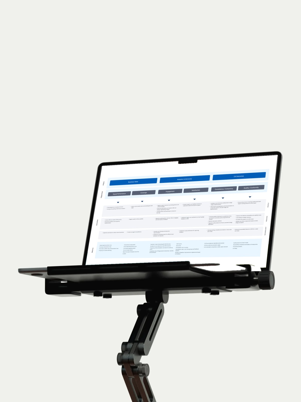
Rebuilt the architecture, team and review model for the design system, with training, documentation and support, so squads could make design decisions without central review.
Aled has always made things. For 20+ years he has done it as a designer — brands first, then products, then the systems and teams behind them. He’s done it in-house, at agencies, and by founding his own businesses. He creates things that don’t exist yet. He identifies opportunities that haven’t been named. He explores what is possible — in product, in systems, in how teams are structured and led. When something is broken, stuck, or unable to scale, he diagnoses what’s wrong before anyone starts fixing it. He has led, scaled and restructured design teams for eight years, and stays hands on with the most complex and business-critical parts of the work.
I lead design through uncertainty, growth and change, from 0–1 products to scaling teams and platforms. I bring clarity, set direction and build capability to create impact now and momentum that lasts.

Approach
Customers don’t experience brand, product and service separately. Using research, user testing and experiments to find what customers need, I work with partners across the business to design a coherent end-to-end experience. I make good design explicit, with principles, standards and measurable design QA.
Capability

Approach
I set the vision and explain the why, how, and what that needs to be done. I show the order it needs doing and set the standards. With a clear operating model and agreement on goals, I can trust the team to make their own calls.
Capability

Approach
Executives back work they can see moving the business, so I tie design effort to the priorities and numbers they already watch. With product and engineering partners, I agree shared goals at the start and we make trade-offs together.
Capability

Approach
Good design keeps a business commercially sustainable, on cost as much as revenue. I connect design work to the measure it should move, whether that is conversion, retention or cost to serve. Every designer on the team knows the KPI their work serves and why it matters.
Capability

Approach
Starting from zero, reaching new audiences and changing an established business all come with unknowns. I start with a clear understanding of the need, use proof to build a hypothesis, and use data to refine the idea. I set direction and sequence the work so each step builds momentum.
Capability

Approach
I run my practice on AI agents with written roles and standards, deciding where they support a person and where they act alone. I prototype to accelerate learning and push design to code, so engineers and designers can collaborate on the bigger problems.
Capability
Rebuilt the architecture, team and review model for the design system, with training, documentation and support, so squads could make design decisions without central review.
Built AI agents that plan, build, review and correct their own work against written standards, so the quality is dependable and repeatable.


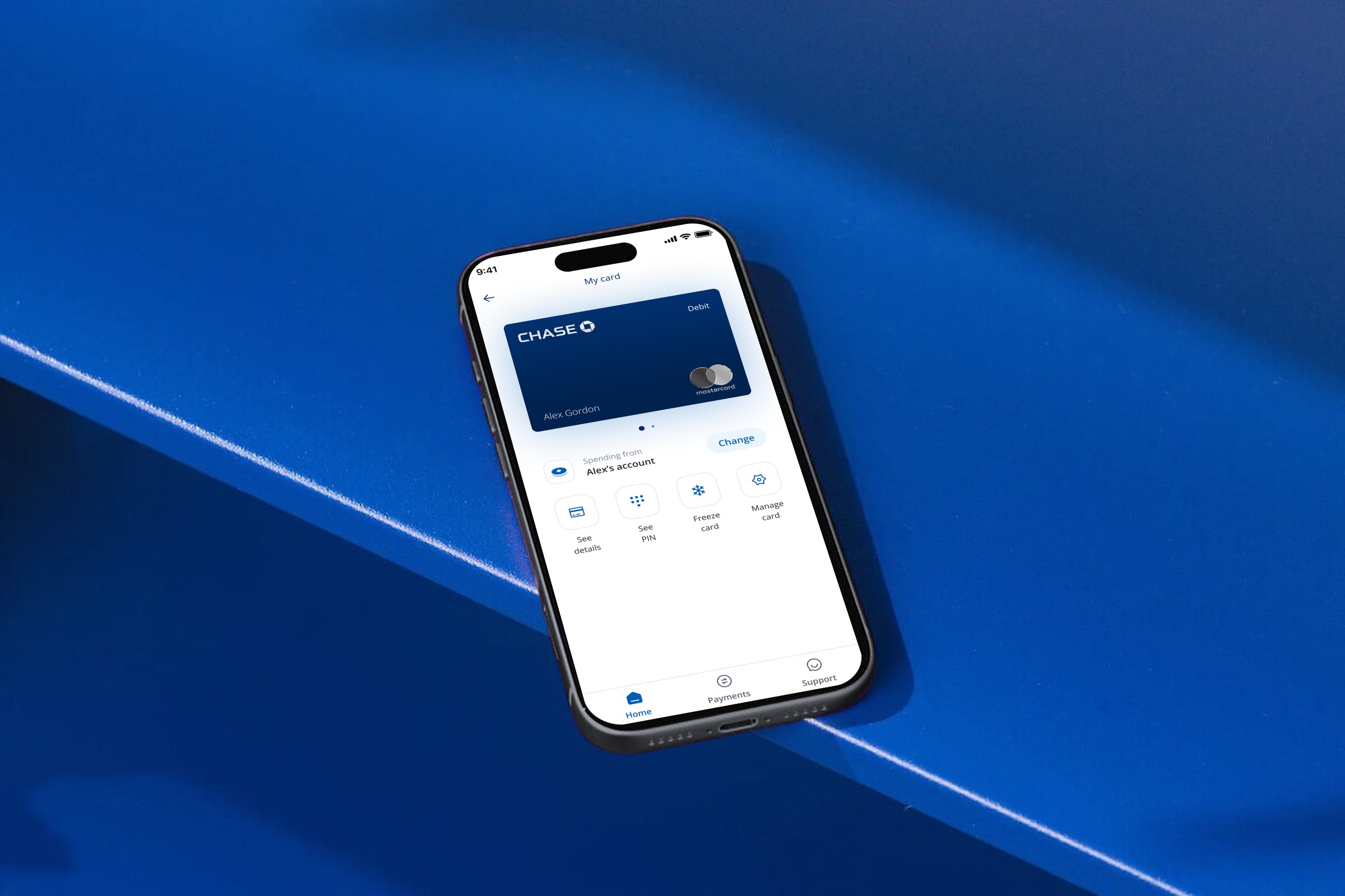
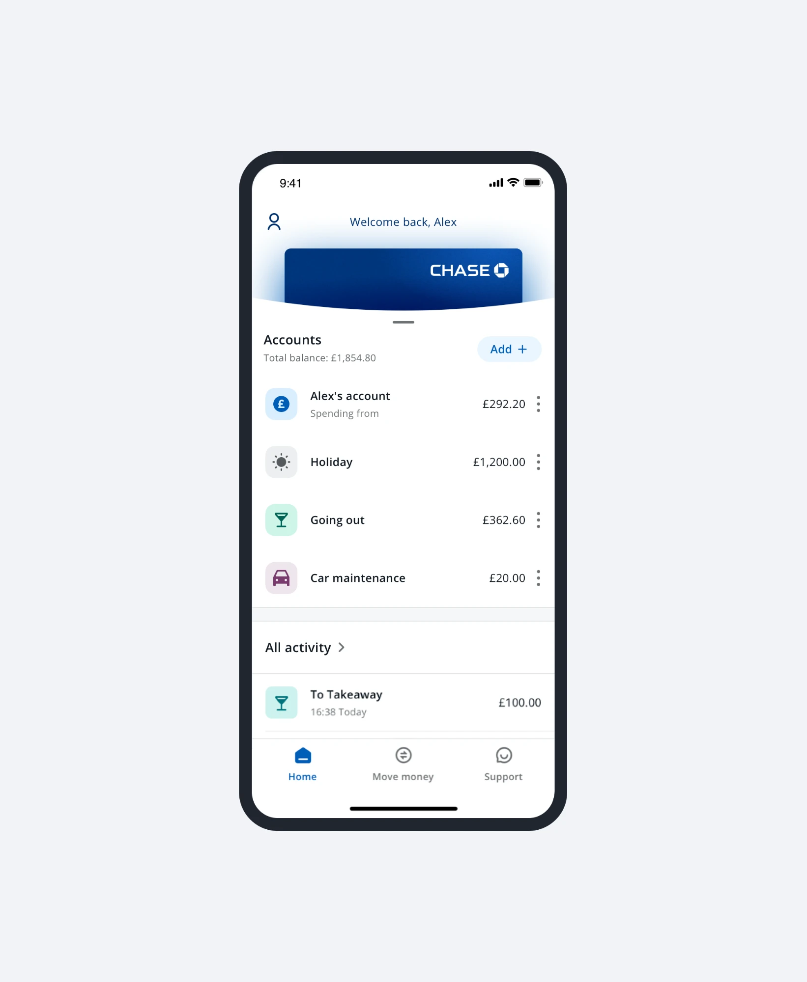
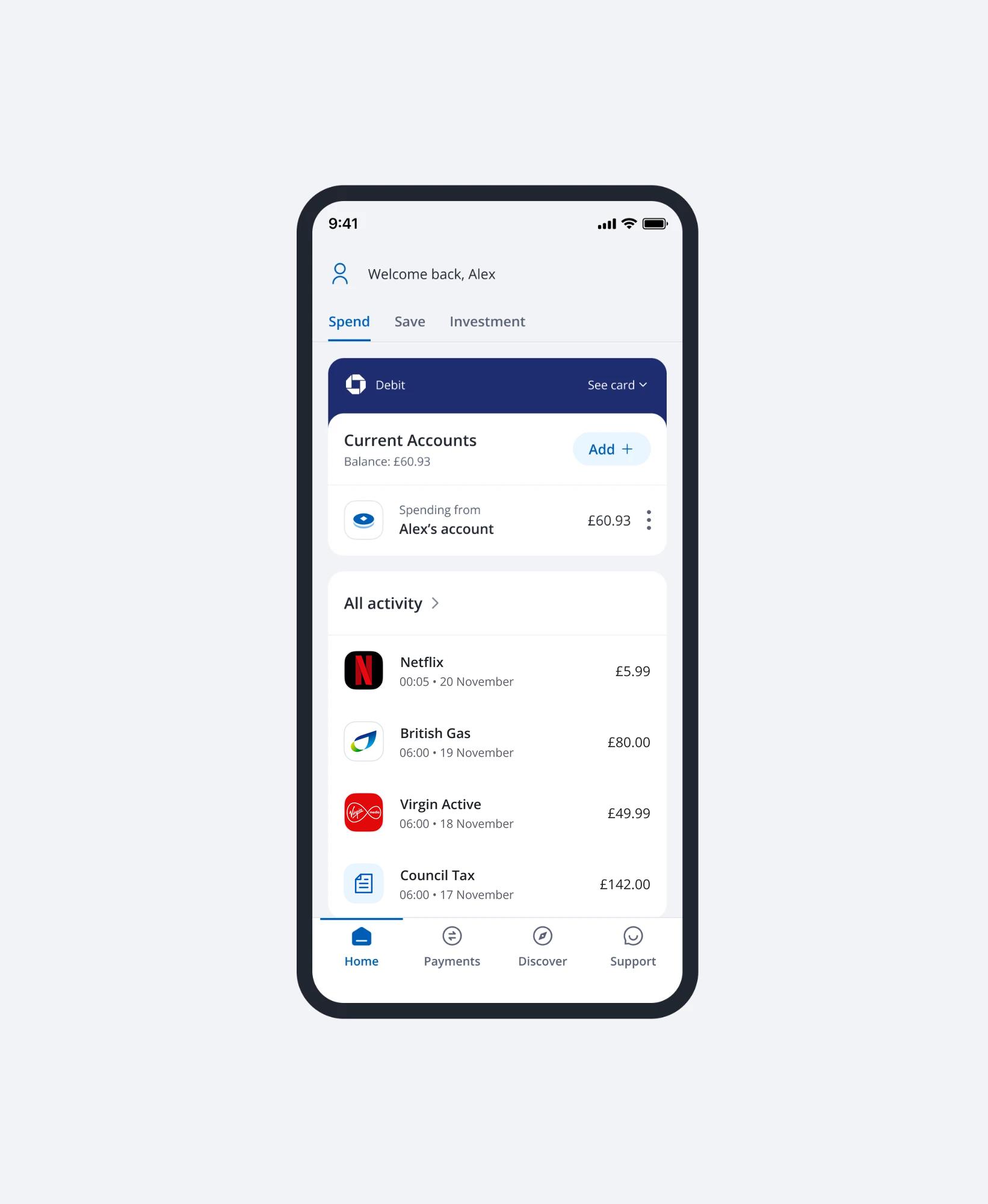
Led the Chase UI refresh, setting systems for colour, depth and motion that keep it minimal with a clearer hierarchy. Released to over a million customers.
Defined how customer data is captured and synthesised into a profile, designed for an AI engine that drives hyper-personalised actions and targeted support for pension savers.
Information and user interface components must be presentable to users in ways they can perceive. This means users must be able to see or hear the content.
Text and essential UI elements must meet WCAG AA contrast ratios:
Colour should never be the sole method of conveying information. Use icons, labels, or patterns to support colour-based indicators.
Read more → WCAG 2.1 SC 1.4.1: Use of ColourText should remain legible and functional when users increase font size via system settings. Avoid fixed-size text or layouts that break when scaled.
Read more → WCAG 2.1 SC 1.4.4: Resize TextAll meaningful images and icons must have descriptive accessibility labels. Decorative images should be marked as such.
Read more → WCAG 2.1 SC 1.1.1: Non-text ContentVideos must include captions for spoken content. Audio-only content should be accompanied by text transcripts.
Read more → WCAG 2.1 SC 1.2.2: Captions (Prerecorded)Read more → WCAG Media Accessibility: TranscriptsAnimations or transitions must not interfere with readability or comprehension. Support reduced motion settings.
Read more → WCAG 2.1 SC 2.3.3: Animation from InteractionsUse consistent typography, spacing, and layout to guide users through content.
Read more → WCAG Cognitive Patterns: Page StructureEnsure that important content is not hidden behind gestures, hover states, or animations that may not be accessible to all users.
Read more → WCAG 2.1 SC 1.3.1: Info and RelationshipsDesigns must adapt to different screen sizes and orientations without losing meaning or functionality.
Read more → WCAG 2.1 SC 1.4.10: ReflowUser interface components and navigation must be operable. Users must be able to interact with the interface, regardless of their input method.
All interactive elements are reachable via screen reader focus (e.g., VoiceOver, TalkBack).
Read more → WCAG 2.1 SC 2.1.1: KeyboardFocus should follow a logical, intuitive path that matches the visual layout and reading order.
Read more → WCAG 2.1 SC 2.4.3: Focus OrderAll focusable elements must have a visible and consistent focus style to help users track navigation.
Read more → WCAG 2.1 SC 2.4.7: Focus VisibleInteractive elements must meet minimum touch target size (e.g., 44x44pt) to support users with motor impairments.
Read more → WCAG 2.2 SC 2.5.8: Target Size (Minimum)Custom gestures (e.g., swipe, pinch) must have accessible alternatives or clear instructions.
Read more → WCAG 2.1 SC 2.5.1: Pointer GesturesAvoid interactions that rely on device motion (e.g., shake to undo) unless alternatives are provided.
Read more → WCAG 2.1 SC 2.5.4: Motion ActuationDesigns must scale and evolve. Interfaces should remain performant, consistent, and flexible as products grow and user needs change.
Ensure designs follow shared standards and are easy to maintain.
Designs use approved components from the design system where possible, avoiding unnecessary custom elements.
Spacing, colour, typography, and motion tokens are applied consistently across screens and states.
Designs are annotated or linked to documentation that helps developers implement them accurately.
Ensure shared experiences feel familiar across mobile and web.
Designs respect platform conventions (e.g. navigation, gestures) while maintaining brand consistency.
Buttons, forms, and other shared elements behave consistently across platforms unless there’s a clear reason to diverge.
Designs adapt to different screen sizes and orientations without breaking structure or usability.
Account for user expectations for speed especially in high-frequency or high-stakes flows.
High-frequency or high-impact interactions (e.g. login, checkout, navigation) are designed to load quickly and respond without delay.
Designs consider poor network conditions, with fallback UI and retry options.
Visual cues (e.g. skeleton screens, loading indicators) are used to reduce perceived wait time.
Design choices (e.g. image sizes, animation complexity) consider performance impact on low-end devices.
Perceivable, 1 of 9
Defined and introduced UX, UI and accessibility standards and design system QA, so designers know what to prepare and reviewers know what to check. The same standards now guide the AI agents in my practice.
careerOSMy career as markdown files an AI can read and reason over.Coming soon
Mr Pritchard’s Guide to Design
Open to new roles
Head of Design and Design Director roles, full-time, contract or interim. Also available for speaking at conferences and on podcasts.